Re-do the menu's

aeroripperaeroripper Join Date: 2005-02-25 Member: 42471NS1 Playtester, Forum Moderators, Constellation
At some point, all the menu's should be reworked to look a lot more slick, and more shiny. The best example is SC2's menu system (which is awesome looking). You get detailed info hovering over every item, which is especially useful for all of the graphics options.
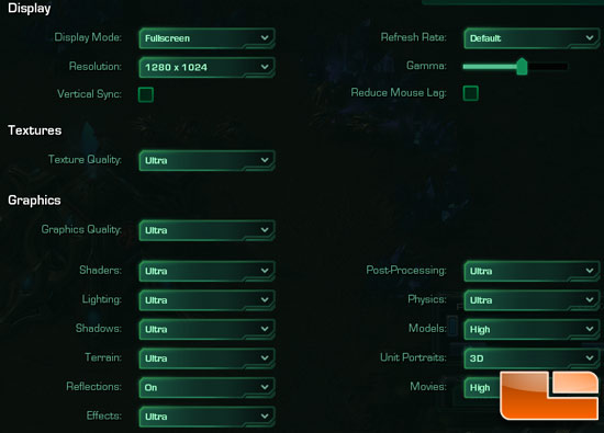
SC2-settings.jpg

Comments

  • NordicNordic Long term camping in Kodiak Join Date: 2012-05-13 Member: 151995Members, NS2 Playtester, NS2 Map Tester, Reinforced - Supporter, Reinforced - Silver, Reinforced - Shadow
    Was talking about in clogcast. They are looking into it.
  • IeptBarakatIeptBarakat The most difficult name to speak ingame. Join Date: 2009-07-10 Member: 68107Members, Constellation, NS2 Playtester, Squad Five Blue, NS2 Map Tester, Reinforced - Diamond, Reinforced - Shadow
    edited August 2014
    We know now they're working on a new menu, but I think we should touch on some of the stuff we like from other menus to "draw inspiration" from.

    Notable thing conveniently referenced in aeroripper's signature is to remove the need to load as many game assets when you start the game, as in going with a fixed background like Valve does with all their multiplayer games. This would easily reduce the time spent for players just starting up. (Downside is having to be in a game to get the framerate reading.)
  • _INTER__INTER_ Join Date: 2009-08-08 Member: 68392Members, NS2 Playtester, Reinforced - Shadow
    @IeptBarakat Then again thats what the workshop is for, I myself am using the Fastload menu to have a faster startup. But I also like the eclipse starting screen to look at (same as the descent one, not so much biodome startmenu). I'm turning Fastload off or use different Fastload ones to have some variety from times to times.
  • IeptBarakatIeptBarakat The most difficult name to speak ingame. Join Date: 2009-07-10 Member: 68107Members, Constellation, NS2 Playtester, Squad Five Blue, NS2 Map Tester, Reinforced - Diamond, Reinforced - Shadow
    @_inter_ Yes, it is very nice to look at, but I'm thinking with functionality and efficiency as it's primary focus.

    No disrespect to the people who worked on the previous main menus, but for new players it's pretty much.
    Launching Game-->10s Loading Screen--> Main Menu-->Optimization popup-->2minute Loading Screen--> Options Menu--> Server Browser -->1minute Loading Screen -->Game?

    Anything to reduce this is a must.
  • meatmachinemeatmachine South England Join Date: 2013-01-06 Member: 177858Members, NS2 Playtester, NS2 Map Tester, Reinforced - Shadow, WC 2013 - Supporter
    Funny, I was thinking about this just the other day.
    The current interface does the job, but it does look pretty errm... Behind compared to a lot of modern games.
  • _INTER__INTER_ Join Date: 2009-08-08 Member: 68392Members, NS2 Playtester, Reinforced - Shadow
    edited August 2014
    @IeptBarakat I still think cutting back at the 10s Loading Screen by removing the cinematic background isn't that worthwhile, especially because there are mods out there that do exactly that. SC2 for instance takes way longer to load the menu screen. If you wan't to join a game efficiently then you should use Steam server browser.
    When changing the menu, I agree with @meatmachine here, it should be the interface design only.
  • IeptBarakatIeptBarakat The most difficult name to speak ingame. Join Date: 2009-07-10 Member: 68107Members, Constellation, NS2 Playtester, Squad Five Blue, NS2 Map Tester, Reinforced - Diamond, Reinforced - Shadow
    @_INTER_ Mods are meaningless to a new player you have to load the main menu to activate the mod anyways, and besides we're talking about the 'official' main menu.

    Cinematic backgrounds are rather unnecessary in multiplayer games, it might leave a nice first impression but in the long run you'll be taking longer to get into a game because load times.

    Also do you mean this Steam server browser?
    FXWfNYj.png

    If so, then I'd love to be able to use it.
  • _INTER__INTER_ Join Date: 2009-08-08 Member: 68392Members, NS2 Playtester, Reinforced - Shadow
    On the long run, player's will explore the Workshop anyway. I love the idea, that the Workshop has items for costumization other than ingame stuff.
    Like Wasabi said in the Clogcast concerning a vanilla crosshair options: The workshop is there for something.
    So I value "First impression" more than beeing able to quickly join a game with boring fixed background.

    About the Server Browser: you unfortunatly need to add servers manually per IP address first. Also add 1 to the port. If port is 27015, use 27016 instead. Otherwise it
    doesnt appear in the list.
    Hmm maybe one can create a script to add all Hive servers to the browser? https://developer.valvesoftware.com/wiki/Steam_browser_protocol
  • SantaClawsSantaClaws Denmark Join Date: 2012-07-31 Member: 154491Members, Reinforced - Shadow
    The steam server browser can detect ns2 servers, but not if you filter by game. For some reason you have to not filter by game, instead type "ns2_" under Map, and it will show you some servers after a looong waiting period.

    It's a known issue, and apparently it's not getting fixed any time soon. Valve are apparently the ones who have to fix it.
Sign In or Register to comment.