NS2_outerrimark "Outer Rim Ark"
UncleCrunch Mayonnaise land Join Date: 2005-02-16 Member: 41365Members, Reinforced - Onos
 Mayonnaise land Join Date: 2005-02-16 Member: 41365Members, Reinforced - Onos
Hello
Here is a new map. There are 2 or 3 sections that looks like Veil (layout), the rest isn't at all.
How far it is done ? The map has some part close to final design and some are more basic. This is no gray box either. Proper lightning are set.
I'm at the point i have to make ppl play it to verify what's good and what's wrong.
I intend to make new textures and Skybox, so i don't want to go on that road before checking things are ok.
Feel free to contact me to report things like that. It is better when mappers get feed back from players.
If you want to test it (tactical) it will be nice. Maybe SCC on Sunday can try it. Thanks in advance.
Edit: Forgot the link isn't it?
There you go :
http://steamcommunity.com/sharedfiles/filedetails/?id=262105837
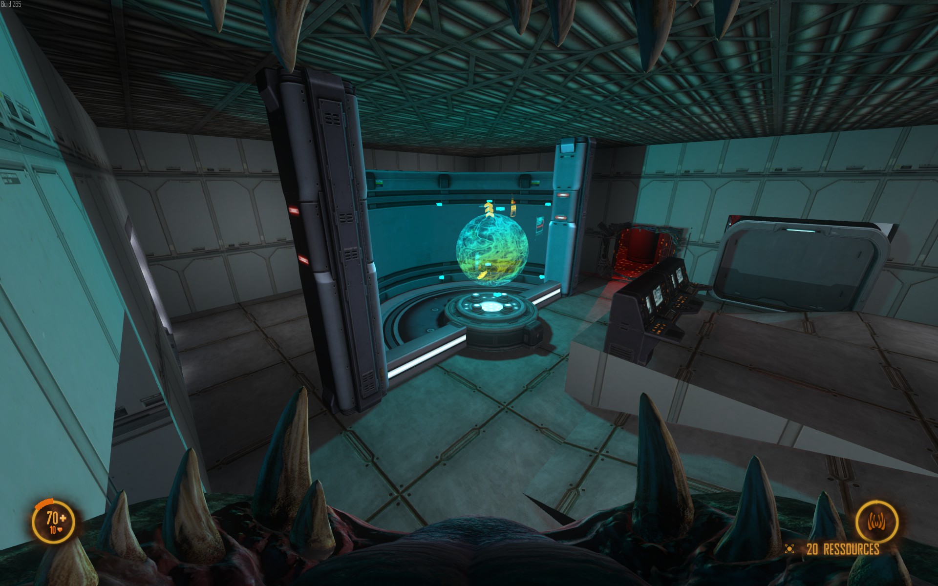
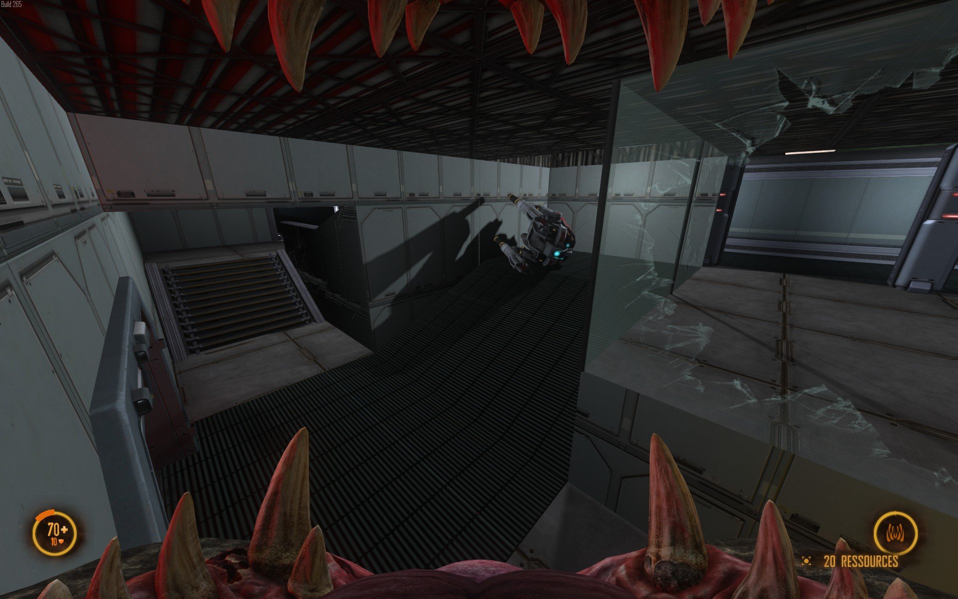
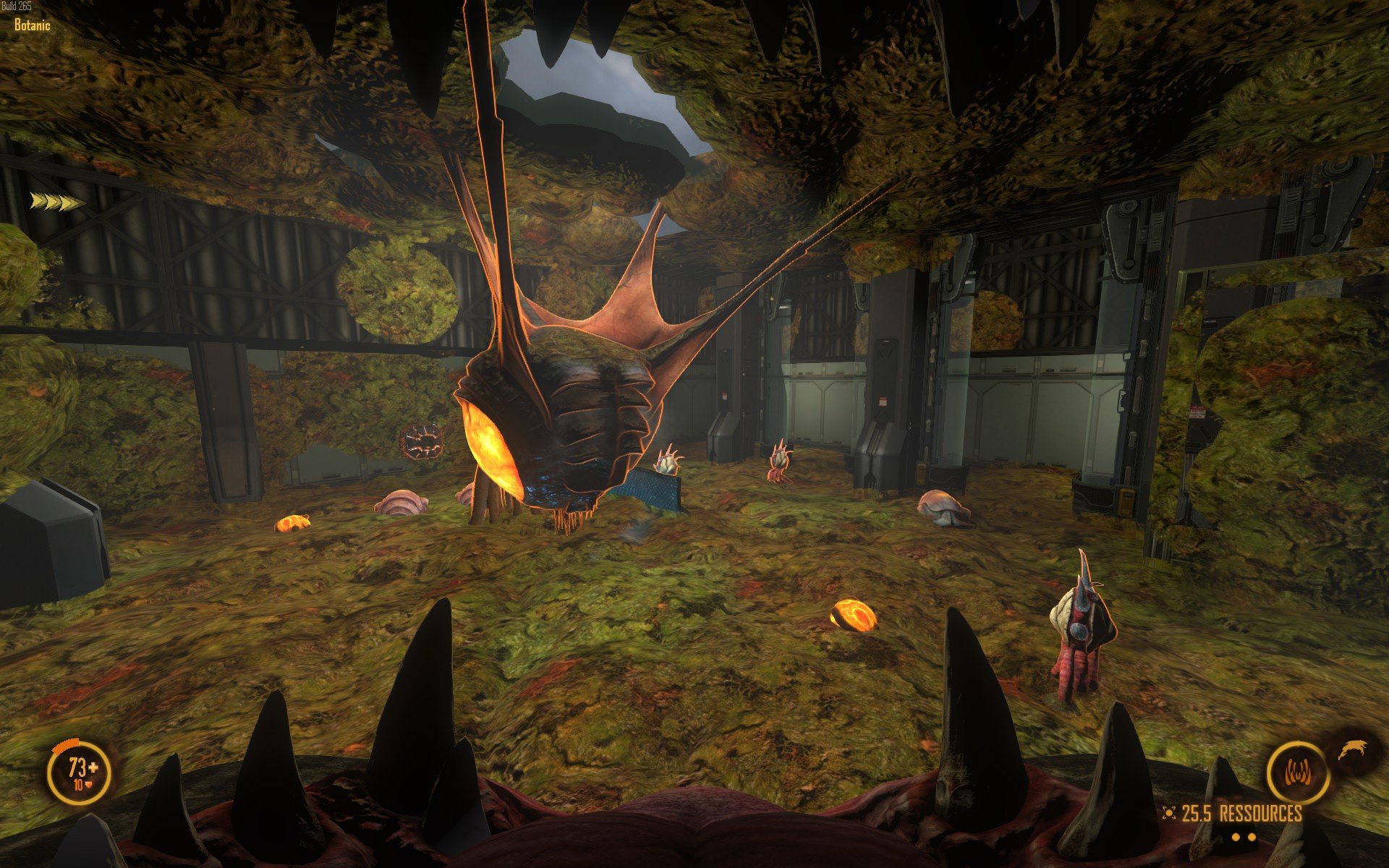
Some screenshots :


Comments
Just let me know if you want some tests by our NSL Maptesting team. Like ns2_relic previously, I think we have possibility to fight on your map, only to try & check layout itself. If SCC could try it before, that would be awesome as well. There's a lot of new maps, in beta or alpha from so many mappers, but it's just impossible to test all these maps once.
We've got some priorities for this current week & the next one, but I can imagine to do something, hopefully, in 2 weeks.
Do you have any idea for a potential history of your map? And how many Tech/Res points? I guess 4/10, like Veil?
It's a 5 TPs in cross with a particularity. The center TP is a little hard to ARC. 9 RTs. So Teams have to fight hard for center both ways (defending / attacking).
My 1 million dollar question is : should i add an alley from center to North ? Right now i tend to yes. But it has to be confirmed. It changes many things on the tactical layer.
I did test with bots, but bots are bots. It is good to see how "hoomans" behave in there and how commanders innovate. What I'm seeking for is validation on the tactical layer. Measuring distances is Ok but to some extend not enough.
No need to write novels. Just something like "this vent should be better here", "add a vent here because", "room un-defendable while it should be a little more", "here needs more obstacles". etc.
I can join a server if invited but only as spectator. I know it like the back of my hand already. Wouldn't be fair.
Notes :
-The circle alleys are a little thin for some taste. It's done like that for WJ purposes as it is big and looks shaped like a straight line.
-Some rooms may looks large but in the end when it's all filled up with tons of stuff, it won't.
Scenario; An arch is something that travel to deliver or save what is important. So a starship will do. More in the mod description.
-Added some custom textures
-Added Custom Skybox
-Starting to populate one little room.
Pls test if you can/like.
It is now time to say things are going forward.
I worked on many things in there. Here are some screenshots :
Hope you enjoy.
Some news
Change log:
2014 06 22
Better make a % for each room. So...
95% is finished but not yet tested in a proper game.
Texture:
New ora_conduit_croisement_001 & ora_conduit_pavage_plat_001 for vents.
ora_glass_decal_001 for glass stuff.
Fixed Bug:
Solved bug "Shader is missing technique for rendering a light".
Message are spaming the console and render the editor slower and slower with time. Not the engine during game. It was a set of lights and spots accidently set with "shader fade rate = 0". So "Shadow fade rate" should never be set to 0. Editor doesn't have a search tool that would have been helpful on that case.
Now as the file grows, it's better to work without this annoyance.
Ok guys this is no longer a WIP. I'm far beyond that.
The map is almost complete. Playable, (add)bots behave properly, so it is time to get humans into it.
Average +100 FPS (even with infestation) on a I7 3570k + AMD 7950
So far i tried to keep low the "crate" syndrome. if you feel some crates (or other obstacles) are needed on some areas for tactical purpose. We can work on that.
Feel free to play and test. Whatever the feed back as long as it is constructive is welcomed.
Hope you SCC guys can find a slot to test it. See ya on Sunday.
Here:
http://steamcommunity.com/sharedfiles/filedetails/?id=262105837
The boring stuff:
*Overview.exe doesn't render map when it's a custom texture. While it looks ok in game and / or in editor. Maybe i'll have to replace these texture with NS2 original texture for a map rendering.
*Rework colors for textures
ora_sol_001
*Rework textures
ora_vaisseau_exterieur_001 (outside)
the skybox textures
remove the background galaxies and procedural nebulae clouds
Try to make a better blue galaxy (more detailed)
remove the pink galaxy (even we don't really see it).
render 2048x2048
ora_conduit_pavage_mur_001
ora_conduit_pavage_plat_001
*Make
A proper "Tube texture" for the quarter circle hole (maybe the alpha is the problem)
New posters / TV textures (quick win)
Textures for Secret room. The Mapper gods are counting on it.
Secret room (theme already selected)
*complete Locker with little props.
* Find a way to keep grate shadows and improve FPS on some areas like Black sector and Holographic. Something is wrong in there. I suspect spot with shadows enabled.
Would do:
* Animation of a drone drifting outside
*Make a animation and video with completed areas.
Change log:
2014 07 10 :
-Occlusion walls have been optimized to remove useless vertice.
-Colors in map have changed a little
The north side is blue / bright most of the time / clean
The south side is green / yellow / red / with atmospheric / darker (alien side)
Oh and personally, I didn't take a look on your 'boring stuff". hehe.
The SCC has recorded a maptest of it by the way (published today on youtube).
Here is the minimap without the texture bug
It was clear teams were unbalanced. That said; this video shows that :
Marines can go south and keep aliens busy. I do think that knowing the map better would help. We clearly see that Meatmachine and Daan were the "death dealer duo" on the second round.
I still wonder (as others) why alien surrendered on the second round. You were keeping us busy, ...truly. It means if marines focus on something; aliens have an opportunity to do something and that matters on the tactical layout.
Nano Workshop is a "one exit nest" and needs to be opened on North side.
So... what should i do ?
this :
or this
Stay the little questions
Should i add another RT point on north side, between Nano and Bridge (10Th RT) ?
More light on north side ?
A vent from Nano to North location or south ?
example at 8:40 in that video, the wall just looks bare to me.
A tenth RT between nano and bridge would be weird...
Biggest problem is the two tech points in the north. It has a Veil FIVE vibe that I don't like, because it focuses the marines on the north side of the map.
This is why I like the official Veil map, because the Central North marine tech point forces marines to go both sides. When you look at it you can see the clear influence of Veil on the Outer Rim Ark design, and that's a good thing, especially with the Nano Techpoint twist that you should keep.
But my point is that the two marines tech point unbalance the whole thing.
I played a bit on the map with a few friends, we had Mapping and Botanic starts. the map is so big that we needed a first pg in Analysis (because that's a tech point) and then another one more offensive. But the one in Analysis was essential for map control. If we had only one pg, we would have lost a lot. because there are so many ways to get past the marines lines. Plus if you start in Mapping, it's very hard to pressure Recycling without a map control pg (defensive), because you have to run all the way there.
Also, I don't know what do you think about vents in the north part of the map. Being a lerk there is quite hard.
ps : I wonder if cargo is not a bit too isolated also.
pps : I think the second layout is better. Make Nano a central point of interest for both teams. It would balance the fight for map control better.
Second layout is better because there is an access path for both marines starts.
ppps: I like the left side of the map aesthetically speaking
And one last thing Botanic and Recycling are very hard to ARC imo
Just wanted to say also that if I'm very critical with this map, it's because I like it, you've done an awesome job and it's all meant to encourage you to go on.
Looking forward to hearing from you soon again
It's a 5 TP in cross configuration. It was that or a Summit cardinal point location (North, East...). Which is the same basically. Only the shape of it change.
Well... i hate Veil (not veil5). It's a wrong map for NS2. Totally script-able. You don't even have to think of a strategy. It may be appealing for beginners because the plan is the same at every game. But after many version from NS1, and this remake. I avoid playing it. Beautiful but worthless to me on the strategic layer. NS2 is a 5 TP game. This the thing that enable real strategy.
I have to make a rule on the map. Like : If the marine team starts at Mapping the alien team should start at Recycling. most of the time; opposite points but not always.
North is marine sided, so less vents, big rooms, less obstacle, more light, and so on.
On purpose. It's long to explain. It's about time to get there for alien and weakening the south a little.
It is. If you come from Nano, you usually select the closest room instead of another, which is better.
I've seen worse don't worry.
Main changes are:
a new connector that will connect Nano to the 2 north quarter Circle
Change log:
Besides that... map is large yo.
Like during tonight's SCC maptesting session
ps : we talked about the map with some other TkM/TkW players and we thought the map was too big for competitive games.
And it is only fit for at least 8vs 8 ff games. What do you think about it ?
I'm working on shrinking it.
Huge work ahead but many tricks to apply. So... hope is not lost.
If i can have a marine running from any RT to the next RT using cardinal direction like North-South or East-West in between 10-13 sec it'll work.
Not to mention that on some official maps, timing are somehow out of the threshold. Another debate that won't happen here.
The main issue will be, to make sure ARCs situation are not too easy to set up.
I wonder if we can have a entity or a thing like "Tunnel allowed" but for ARCs range and other stuff. Even setting up variable like speed, gravity. I never explored that area, i must say.
Next week end or so.
Back in business, the update is online.
Changelog:
The layout:
The layout with chrono
I still have to do but nothing crucial. It can wait some other updates.
Occlusion in center to finish
More props here and there.
Screenshots updated here:
http://steamcommunity.com/sharedfiles/filedetails/?id=262105837
Today is a cosmetic update day:
It seems my checklist is all green on that update.
If you see glitches or something : screenshot or it never existed !
@MauvaisVitrier : Seems ok & ready for Oct 11th.