[Project] Flyers Nuremberg
korvo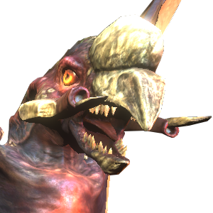 Join Date: 2009-11-19 Member: 69427Members, Squad Five Blue
Join Date: 2009-11-19 Member: 69427Members, Squad Five Blue
<div class="IPBDescription">German Advertising in Nuremberg East</div>I try to spread flyers in the east of Nuremberg. But first I need the help of you to design some flyers. I have a good relationship to a pizza supplier, and there is a possibillity to attach a NS2-Flyer as supplement, so that there are no extra fees to spread it to thousends of people in Nuremberg. I even see a chance to print thousands of flyers with low budget. The designed flyers could be used in several cities, but with low budget I only have the chance to spread it in one area.
I need you for these steps:
1. design flyers
2. choose the best concept
3. if not translated: <b>insert</b> translated contents (I'll translate for you)
I need you for these steps:
1. design flyers
2. choose the best concept
3. if not translated: <b>insert</b> translated contents (I'll translate for you)
Comments
<img src="http://dl.dropbox.com/u/30576984/flyer-by-ybarra.png" border="0" class="linked-image" />
<img src="http://dl.dropbox.com/u/30576984/flyer-by-ybarra.png" border="0" class="linked-image" /><!--QuoteEnd--></div><!--QuoteEEnd-->
I like this idea. I would suggest making the flyer cut diagonally, and fill up each side with art of the different classes, facing each other. And color the backgrounds yellow-orange for the Kharaa and blue for the marines. Then I think the trademark "Natural || Selection" straight horizontally across, with a link below it in a color that stands out. Also you could toss on a good quote at the bottom or something.
I think just letting the art speak for itself would draw the right crowd in.
I'm attaching a quick mock-up. Don't judge, I'm not a great artist :P
<img src="http://dl.dropbox.com/u/6060870/NS2%20Flyer%20Mockup.jpg" border="0" class="linked-image" />
I forgot the poor gorge :(
<img src="http://dl.dropbox.com/u/30576984/flyer-take2.png" border="0" class="linked-image" />
The tribals behind the "NATURAL SELECTION" have nothing to do with NS2, I would spread infestation there instead. So, behind the letters of "NATURAL SELECTION" there would be infestation creeping from the sides to the middle.
The direction is important as two sources of infestation that creep towards one point in the middle seem much more menacing than one blod of infestation that spreads in different directions.
Secondly the two horizontal lines above and below the "FADE VS. MARINE" don't have any value of recognition for NS2, replace them with the blue-ish transparent boxes of the marine hud.
KHARRA
NS2 IST EIN AUßERGEWÖHNLICHES FPS/RTS SPIEL, DAS DIESEN SOMMER AUF DEM PC ERSCHEINT.
MIT ATEMBERAUBENDEM KARTEN UND CHARAKTER DESIGN
WIRD DICH DIESER MIT ACTION VOLLGESTOPFTE THRILLER AUF DEN STUHL FESSELN.
AUF DER EINEN SEITE GIBT ES DIE "Kharaa" UND AUF DER ANDEREN DIE IMMER WACHSAME "TSF".
DAS SCHICKSAL DER GALAXIE BERUHT AUF DEINEN HÄNDEN!
Wirst du kämpfen um deine Zivilization vor dem bevorstehenden Verhängnis zu bewahren?
Deiner Species droht die Ausrottung, was wirst du tun?
DIE ENTSCHEIDUNG GEHÖRT DIR!
ZWEI TEAMS.
EIN ZIEL.
WER WIRD DIE GALAXIE BEHERRSCHEN?
DU ENTSCHEIDEST.
FRONTIERSMAN
<img src="http://dl.dropbox.com/u/30576984/flyer-take3.png" border="0" class="linked-image" />
There's a lot that goes into advertising, if you have any questions I'd be more than willing to help with this :D
- Logo at the top, I would move it to the center (overlaying the alien/marine) while keeping the other lines at the top to grab attention.
- The way they are facing each other, they look like they have each others backs. Try to see if you can make a version where they face each other for a head-on
collision. This should make for a more intense image.
- Use small quotes with a large font size.
- Increase size of time of release just a bit.
- Keep URL's simple, don't include http://. Use: www.unknownworlds.com/ns2 or www.naturalselection2.com (I wish they'd make up their minds and use one of those). Linking directly to the buy page might come across as too pushy.
- Perhaps some more graphical details, such as the spreading of infestation mentioned earlier.
I can post the source logos if you like so you can edit it to your liking Ybarra
<img src="http://i3.photobucket.com/albums/y88/Blitz-Those/flyer-take4.png" border="0" class="linked-image" />
<!--quoteo(post=1931297:date=Apr 28 2012, 10:05 PM:name=JuCCi-PuCCi)--><div class='quotetop'>QUOTE (JuCCi-PuCCi @ Apr 28 2012, 10:05 PM) <a href="index.php?act=findpost&pid=1931297"><{POST_SNAPBACK}></a></div><div class='quotemain'><!--quotec-->black and white or colour?<!--QuoteEnd--></div><!--QuoteEEnd-->
colour.
<!--quoteo(post=1931785:date=Apr 30 2012, 01:28 PM:name=BlitzThose)--><div class='quotetop'>QUOTE (BlitzThose @ Apr 30 2012, 01:28 PM) <a href="index.php?act=findpost&pid=1931785"><{POST_SNAPBACK}></a></div><div class='quotemain'><!--quotec--><img src="http://i3.photobucket.com/albums/y88/Blitz-Those/flyer-take4.png" border="0" class="linked-image" /><!--QuoteEnd--></div><!--QuoteEEnd-->
This looks great! Try to brighten up important stuff (fade+marine+font effects) - dark things look different when their are printed...
...oh and: the text on the buttom is way to small. Try to imagine A5.
<!--quoteo(post=1931834:date=Apr 30 2012, 04:33 PM:name=PersianImm0rtal)--><div class='quotetop'>QUOTE (PersianImm0rtal @ Apr 30 2012, 04:33 PM) <a href="index.php?act=findpost&pid=1931834"><{POST_SNAPBACK}></a></div><div class='quotemain'><!--quotec-->I definetly like it better with the steam logo on there.<!--QuoteEnd--></div><!--QuoteEEnd-->
I don't like steam in general, but unfortunately this really looks a bit better with it and it's an important information. But it's possible that we must not use it because of the copyright. If it would be at the final design, UWE had to ask Valve before. In theory the same apply's for UWE images, practically I'm sure UWE won't put obstacles in our way...
Edit:
However: This week is for BRAINSTORMING. You are welcome to create fully developed designs, but you don't have to.
We are still in the phase of brainstorm. At the moment I can't guess the time we have for the next print, but at least this week is open for ideas.
The project schedule results from that deadline. Please try to reguard it. I'll update you about the current steps we need next.
Everyone is welcome to post ideas here. If you have some styling skills and are interested in participating, please send me a PM.
Sorry, my words were not clear enough: I can translate for you (I updated the first post now). I woun't translate it word for word to keep the meaning. E.g. you don't say "die Entscheidung gehört dir" for "the choice is yours" but "du entscheidest" or "deine Wahl" - however, this statement doesn't sound good in German at all - but let's keep that discussion for the detailed concept at the middle / end of May.
Edit: Are you able to change his stance? Instead of right foot forward have his left one forward. If that's not possible then can you flip the image so that he's looking left, the Fade on the right and swap the Kharaa vs Marines to Marines vs Kharaa
If no new ideas are posted, Ybarra's idea is the one to refine in detail.
Didn't though that we got a great flyer within hours. If you have completely new ideas - please post it now!
it looks like the fade is covering the marines back, they should oppose each other, like in hughs waitingscreen for livecasts.
And the designs market NS2 as if its a movie which I don't think is a good idea. I'd just say what it is.
QR codes are good to use.
If someone want's to reward my efforts - I've spend much more time on creating images and translating contents for the <a href="http://www.unknownworlds.com/ns2/wiki/index.php?limit=500&title=Special%3AContributions&contribs=user&target=Korvo&namespace=&year=&month=-1" target="_blank">Wiki</a> (Not to mention bug reports and further stuff).